Mad science! Sleepwalking! Drowning Fish! Helpful Flies!
 Welcome to the mad dreaming world of Halbtraum, a short animated film by Marco Jeuring and Tobias Wüstefeld.
…and there’s a “Making Of” short, too.
High res, Divx versions here
Low res, Youtube versions:
Halbtraum
“Making Of”
This entry was posted on Saturday, March 15th, 2008
and was filed under Computer Graphics, Found on the Web
There have been no responses »
In the past week or so I’ve seen an ice storm (my first, and pretty interesting to see), a snowstorm, some power outages and an internet connection that was up and down and up and down… and so on. So while 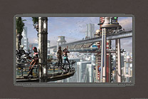 I haven’t posted here, I was busy – I’ve wrapped up my six-weeks-long work on this retrofuturistic city picture, then discovered that there was a t-shirt and even a clock design in it, and now that I’m predictably online again I’ve added those to my online shops in nearly every way it can be added.
By “nearly” I mean that although it’s now available as an archival print, I don’t yet have a poster quality version of it up. There’s a bug in the printer’s system that’s preventing me from making that available in a standard framing size. Once that’s sorted, there will be a poster too.
 I didn’t expect any part of that large rendering to turn up on t-shirts, but I found that there was a pretty nifty shirt hidden away in there. So in the long run, it’s become an archival print, a greeting card, a clock (!) and a whole collection of lovely and talented shirts.
The name I finally settled on for the picture is “The Clouds Will Soon Roll By”. That’s the title of a popular song from 1932 which I first heard as part of the soundtrack for Dennis Potter’s Pennies From Heaven.
I think I’ve got a couple more of these in my head, about ready to force their way out in the near future; we’ll see!
This entry was posted on Tuesday, March 11th, 2008
and was filed under Computer Graphics, Works in Progress
There have been no responses »
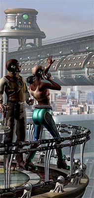
Yep, I’m still working on my City of Tomorrow – or the City of next week, or possibly the week after that. I’ve done all the work on the foreground balcony and its characters, barring adjustments and post, and having done that I now have some ideas for changes I’d like to make in the middle distance; then there are some other elements I’ve been planning to add in between.
 So, like I said – the city of next week or the week after. Give or take.
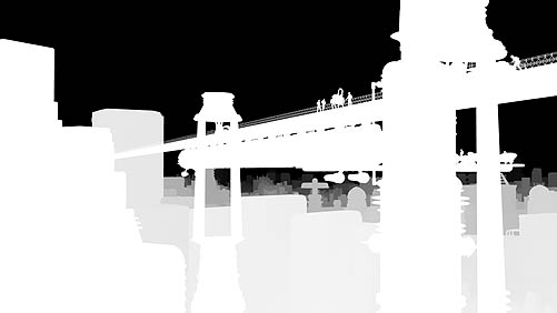
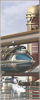
It’s a little painful to see what happens to it when I shrink it down this much. With any luck, though, this bit of a close-up on the left will give you a better idea of what’s what.
Not too many misadventures on this bit, though as always some bizarre things did seem to happen. I’ve been meaning to try the Guruware Ivy plugin for Max, and so I did that here (in the urns at the upper left). Next time I think I’ll give it a trellis to work with.
There are some small details that’ll reward a viewer who’s looking at the big version – like some Buck Rogers comics pages from the early 1930s, and a wine label (“Volstead Merlot”). That one’ll only make sense if you’ve looked into Prohibition history. And if not, why not?
Still not sure what I’ll call this. I was listening to Gershwin’s “Rhapsody in Blue” earlier and that seemed like the perfect soundtrack for the image – but “Rhapsody in Blue” is such a high-falutin’ name for a picture that I probably won’t be able to bring myself to use it.
This entry was posted on Monday, March 3rd, 2008
and was filed under Computer Graphics, Works in Progress
There have been 2 Responses »
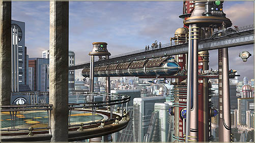
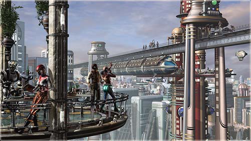
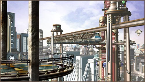
All may seem quiet around here, but in fact I’ve been working steadily on this image (which I posted about earlier, here and here). Although I’ve thought about posting some more updates, I haven’t. All of this new work has been on distant elements, and then the monorail terminal and the sixteen characters who are getting off (or on) the monorail, or working up on its track (see the inset at right). Because of the relative size of all those things they’re scarcely visible when the whole picture is scaled down from over 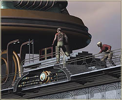 7000 pixels wide to this size, 501 pixels wide. So it’d have been almost pointless to try to keep you up to date. There’d have been very little obvious change.
As of this afternoon, though, I’ve got the far and middle distance more or less set; I’ve done the final (or semifinal) renderings of the three scenes that so far are composited together here, and I’ve added a sort of poor man’s depth of field effect on the distant cityscape.
Although there will be quite a bit of retouching to do in Photoshop, everything you see behind the foreground balcony is in a semifinal state. So I thought I ought to post an update now, before I start working on the foreground.
I had some difficulties with the way 3DS Max does its render effects and rendering passes. The first problem was that I was getting unpredictable results from the Z Depth pass. That’s an additional rendering that uses greyscale to show how far from the camera everything in the picture is – it can be very useful for creating masked effects, like depth of field, in post.
So to get around that, I’ve created a Z Depth pass in a sort of handmade way, using the free Bytegeist “ZTint” plugin for Max. I rendered out a Z Depth version of each scene and combined them together in Photoshop (see below). By using the exact same settings in each rendered layer I’ve built up my own Z Depth version of the background. It makes a geat mask for adding efects to the entire scene in Photoshop, based on their distance from my camera.
In order to get what you see below I applied a white, self-illuminated material to every visible object. The ZTint render effect added black to the object color depending on its distance.
It turns out that it was a good idea to avoid Max’s render elements, because another problem I ran into was that when network rendering the scene in strips – which conserved memory while these very large images were rendering – the additional rendering passes were not rendered correctly.
The main image rendered out in ten strips which were then stitched together at the end. But additional render passes like Z Depth or a specularity pass were never completed in the same way: each strip just overwrote the previous one and they were never assembled together, since only one tenth of them existed at the end anyhow. Annoying.
I’m still using Max 8, so I don’t know if that bug’s been fixed in the more recent versions.
Anyway, it’s now time to turn my attention to all the work I have yet to do on that balcony in the foreground and the characters there. I don’t have any real idea of how long those bits – and the final compositing and post work – will take, but I figure it’ll easily be another couple of weeks before this is done. Luckily for me, I’m not working to a deadline!
This entry was posted on Thursday, February 21st, 2008
and was filed under Computer Graphics, Works in Progress
There has been 1 Response »
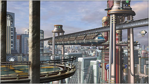
I continue my struggle to show you things that aren’t ready for your eyeballs yet with the current state of my (still to be named) retro futuristic city scene. I’ve made one pass through the middle distance, and a long pass through the distant city, and today I’m back in the middle distance again.
This is the first practical use I’ve made of the city model I started ages ago and worked on again during the fall. It’s interesting to see how I’ve come to use it. Because the city itself is built out of large, complex sections, it was simple enough to drop a complete copy into my 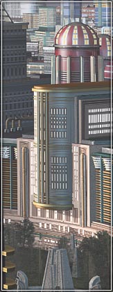 background here. The surprising things happened when I tried to make a picture out of it; like Raymond Loewy’s revision of the Lucky Strike cigarette pack, the real trick was in figuring out what to throw away. So while I did plenty of moving, scaling, and rotating of individual buildings, more than anything else I had to decide which ones to delete completely in order to open up the vista in a way that served the picture.
I added a lot of detail to the monorail pylons and created catwalks that run their length. There’ll be a few workers up there soon. But today I’m positioning some shadow-casting silhouettes that create the illusion that more buildings, out of the frame, are casting shadows across the ones we see close up. There’s a lot of trial and error involved in that. Like there is, um, in everything else.
I’m still handling the scene in three separate layers. Once I combined the far and middle distance into a single scene the rendering times increased pretty dramatically – and having them all together didn’t actually solve any problem I needed to solve – so I split them apart again. Go figure.
One little tool that was all sorts of help here is Martin Breidt’s Image Overlay script for 3DS Max. It’s really meant to superimpose frame numbers and other data on renderings, but it’ll also do a quick image overlay. I’m using it to drop in whole layers (like a Targa image of the foreground balcony) so that I can see how the layers stack up, while I’m just working on one. A back layer’s easy – it’s just an environment map – but it’s been really helpful to composite that foreground in as I go, too.
This entry was posted on Monday, February 11th, 2008
and was filed under Computer Graphics, Works in Progress
There have been no responses »
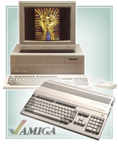 Part 6 of Ars Technica’s excellent History of the Amiga Computer is now online. It takes us through the tumultuous and important years of 1986 and 1987 and – as always – tells the story of some very smart moves which – as always – are completely negated by bizarre corporate decisions. On the block this time are large parts of Commodore’s own engineering staff, who began to design the new Amiga models, along with Commodore’s new CEO Thomas Rattigan.
In order to follow up the soft launched Amiga 1000 Rattigan decided to split the Amiga line into a high and low end model. He felt that the Amiga 1000 fell at a price point the market didn’t understand (too high for a consumer computer, too low for a business computer) and the Amiga 500 and 2000 were meant to fix that by giving each market a machine to love.
Apart from their form factor and expandability they were essentially the same machine, which meant – to me, and to artists like me – that the Amiga 500 made a perfect entry level system, especially when its RAM was expanded to one, count it, one megabyte. That was considered a crazy amount of RAM in those days. We also meet Trip Hawkins, founder of Electronic Arts, and Dan Silva, author of the seminal paint program Deluxe Paint.
I’ve been enjoying these articles all along but it’s getting more exciting to me here because this is about where I arrived. Good reading.
If you missed them, here are the earlier chapters:
This entry was posted on Monday, February 11th, 2008
and was filed under Computer Graphics, Found on the Web
There have been no responses »
I’ve never liked showing work in progress*, and I can prove it.
Though I don’t remember this myself I have it on the best authority that as an infant, I just wouldn’t talk. Just wouldn’t. They were actually getting sort of worried about me, till one day I fell down and hurt my head badly enough that blood poured all over my face, and before I could stop myself, I yelled “Get this stuff offa me!”
The first thing I ever said was a complete sentence. The way I figure it, I wasn’t going to say a word to anyone until I’d conjugated everything that could be conjugated in my head so that no one could hear me make a mistake. True story.
So obviously that means I’d rather not let you see things that aren’t finished, except that’s stupid, so here’s one that’s a long ways from being finished yet. It’s so unfinished that it doesn’t have a name. I usually name these after the titles of, or lines from, popular songs of the 20s and 30s, and though I have a few ideas I’m not sure yet what it’ll be called.
 I’m combining a lot of elements here that I’ve built during the past eight years (which means some of them need some retooling; I spent some time reworking the monorail pylons, for example, which are just so dang big in this picture) along with some new stuff. The new bits are/will be mainly in the near foreground, where some of my newest Retropolitan characters will appear in their glorious high res-ness.
And though at the moment it’s arranged as three separate scenes – eventually, it’ll probably be two – I’m having a wonderful and a very relieved time spreading out into the new memory space that’s available to me now that I’ve finally gone over to a 64 bit OS. There are frequent sighs of relief here in the Secret Laboratory.
I’ve got tons to do on… well, practically everything… but the highlights will be the people on the balcony and what they’re up to, some folks debarking from the monorail, and more, some of which will come as a surprise to me.
The distant buildings are part of my ongoing city model, a necessary and huge asset for my “Empire State Patrol” project. Miles to go before I sleep, and all that.
I’d been planning for this to end up as about an 18 x 24″ poster and print, but it’s shaping up so well that I think I may do the final version larger… about 20 x 30″.
=================================
*So why do I have a “Works in Progress” category here in the blog? Because it’s never too late to change.
This entry was posted on Saturday, February 2nd, 2008
and was filed under Computer Graphics, Works in Progress
There have been no responses »
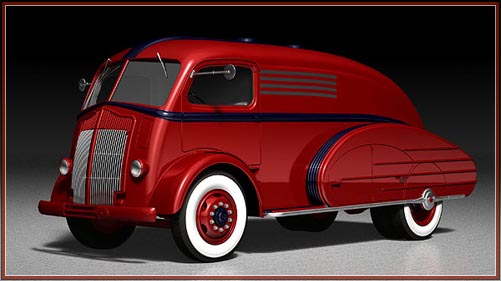
3D modeler Niko Moritz has a portfolio site that’s populated with a series of wonderful streamline cars and trucks (and, well, planes and boats) based on designs and prototypes that weren’t always put into production. There are some real gems here.
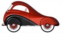 Above is his model of a fuel tank truck design that was patented in 1937, but possibly never built. He’s based it on a period White coe truck, also the foundation for the teardrop marvel shown at right. Both are based on designs by Alexis De Sakhnoffsky.
Other highlights include the classic Cord 810, Jaguar XKE and XK120, and the Hupmobile Skylark. Oh.. and there’s some modern gunge, too :).
This entry was posted on Saturday, January 26th, 2008
and was filed under Computer Graphics, Found on the Web
There have been 4 Responses »
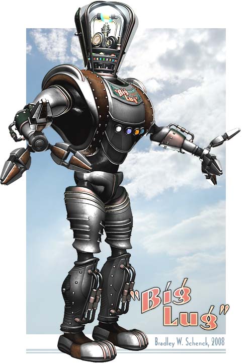
Here’s the textured version of my “Big Lug” retro robot, a new character for my world of Retropolis. He’s big, he’s strong, he’s durable, but he’s not what you’d call the brightest bulb on the chain. This is the famous Mark II Big Lug, the most successful industrial robot to come off the assembly line at the Ferriss Moto-Man plant in Retropolis. You can get a Big Lug in just about any color – the default factory finish is shown here.
The picture above links to a 9 megabyte Quicktime “turntable” animation that I’ve used to see how he looks all ’round, as well as the way light plays across him. What remains to be done is to skin him to a skeleton. I’ve mentioned before that skinning makes me want to throw myself out of high windows. Really, I do mean that in the plural; I’d like to throw myself out of as many high windows as possible, by the time I’m done. But thankfully it’s much easier to skin a robot than it is to skin a human character.
“Big Lug” is now just over 211,000 triangular polygons. There’s some waste in curvy but indistinct areas like his armpits – but I’m not sure how much more optimization I’ll be doing in there.
[tags]Retropolis, retro robot, "Big Lug", science fiction, space opera, retro-futurism, 3d, character, turntable animation[/tags]
This entry was posted on Sunday, January 20th, 2008
and was filed under Computer Graphics, Works in Progress
There have been no responses »
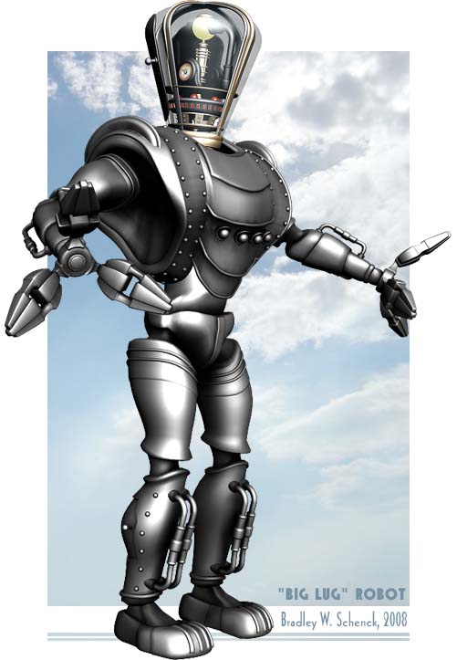
Still loads of texturing to go, though I quite like this basic steely thing he’s wearing. I’ve realized that “Ferriss Motomen” sounds like an instant noodle soup, while “Ferriss Moto-Men” is amazingly better. What a difference a hyphen makes.
This entry was posted on Wednesday, January 16th, 2008
and was filed under Computer Graphics, Works in Progress
There have been no responses »