
Having finished the redesign for my Retropolis site, it was much simpler to make the same changes to The Celtic Art Works. The two shops are built in a similar way: for the most part I’d solved all the problems already.
Okay, they’re not exactly the same. I had several surprises along the way. Still, this shop took about half as much time as the first one.
When I posted about the Retropolis redesign I described it as “phone-friendly”, but I never explained what I meant by that.
It seemed ridiculous to maintain two separate versions of these shops, one for desktops and one for smaller displays. I’ve always thought that was a pretty terrible solution.
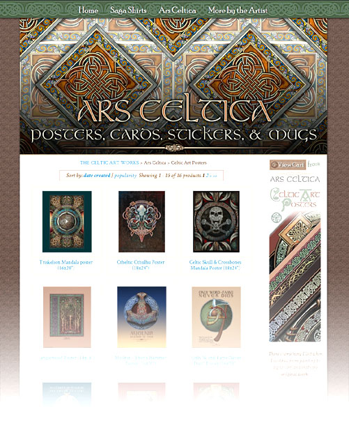
If you view either site on a desktop computer you can see what I’ve done by resizing your browser window, from full screen to just under 400 pixels wide.
You can use CSS to wrap the elements differently at different widths, but there are design limits when you rely on CSS alone. So I made things a bit more complicated.
First, I do the obvious by checking the width of your browser’s window when the pages load – but there’s also a Javascript listener that watches for changes in the browser’s width. Those changes kick off a function that hides some screen elements and reveals others. This works equally well on any platform and also allows the layout to change when a phone or tablet is rotated.
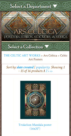
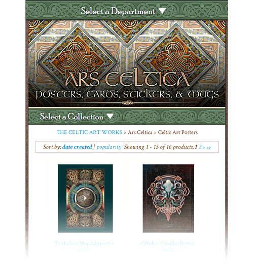
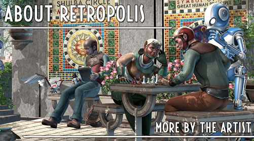
That allows the site to use more than just CSS to move the elements around. If your window’s wide enough (as in the first image), you get a large, fixed-position menu at the top of the page and a sidebar on the right; on smaller displays the wide menu gets hidden, a narrower one is revealed, and the right-hand sidebar is replaced by a copy down below. (Most of that’s shown in the second and third images.)
Because I can make different changes at a variety of widths I’m able to get a pretty good looking layout at almost any size.
Finally, I go through a little dance to adjust the height of the sidebar when it’s visible. You can’t check the height of a floating element in Javascript – ouch! – so I have to check the position of the footer to figure out how tall the sidebar needs to be. That’s the kind of thing that’s automatic when you lay a page out with tables, but ends up being difficult with CSS.
The redesign has a problem with wide left-side content when the sidebar’s visible. So on a few pages I’ve always hidden the sidebar and revealed the lower copy.
Anyway, as I said you can play around with this by resizing your computer’s browser window. I can’t promise hours of fun, but it may be kind of interesting to see the layout change at different widths.
Oh! And consider buying something while you’re there, right?
This entry was posted on Wednesday, October 31st, 2018
and was filed under Web Development, Works in Progress
There have been no responses »
I’ve spent the last two weeks on two projects: rebuilding part of my front porch (which you probably don’t care about unless you’re knocking on my door), and creating a phone-friendly redesign of my Retropolis web site.
I’m not crazy about the ways that phones have affected web page design – and I really miss my old page layouts – but because I am also not actually crazy I finally caved in to peer pressure and converted the site into something that works well on phones. Mostly.
The big exception is the Business Card Construction Kit. You still need a much wider browser window to do much with that one.
But in every other respect you can now shop quite comfortably even on one of those tiny, ridiculous devices that you all use.
So go do that, please, while I dart outdoors between the rainstorms and try to get my deck boards nailed down in time for Winter.
As always, you can find the Retropolis Transit Authority T-shirts, along with posters, greeting cards, postcards, business cards, and other things that are not cards. Like, uh, coffee mugs. And books. And other stuff. Go get ’em!
This entry was posted on Monday, October 22nd, 2018
and was filed under Print On Demand, Thrilling Tales of the Downright Unusual, Web Development, Works in Progress
There have been no responses »
Happy October!
If you’re not sure why Patreon has become so important to me, you can read all about that here.
Yeah. That was depressing, wasn’t it? So let me try to cheer you up with the rewards my Patrons will receive this month.
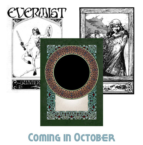
October 6 (for Patrons at $5 and above)
The Selchie is a traditional ballad that I illustrated for Runestaff #29 in 1984. You’ll see the ballad and its illustration at Patreon.
October 13th (for Patrons at $15 and above)
Two print-resolution Celtic knotwork borders at greeting card size, with transparent areas inside the borders.
If you have image editing software you can place your own picture or message inside the border. (These are for personal use only.)
October 20th (for Patrons at $10 and above)
Chapter 1 of the first draft for a sequel to Slaves of the Switchboard of Doom. It’s a first draft, so there are a gazillion things wrong with it.
But the book was going to have two huge problems that weren’t obvious to me when I started. One shows up already in this first chapter.
October 27th (for Patrons at $1 and above)
My 1978 cover for the final issue of Evermist. It may be one of my earliest centaurs. I was going to spend a lot of time with those creatures through the early 80’s.
So, as always, $15 patrons will see something every week while the rest will see one, two, or three updates. I hope you enjoy them!
This entry was posted on Monday, October 1st, 2018
and was filed under Works in Progress
There have been no responses »


