My money's on the Stay-Puft Marshmallow Man.
(link),Jan 20
RT @WardQNormal: The trouble with conspiracy theories is that a lack of evidence is not taken as proof it's not real, but instead as proof the conspiracy is indeed everywhere. This is like thinking that the reason you never see elephants hiding up in treetops is because they're good at it.,Jan 12
Publius Clodius was a populist demagogue in the late Roman Republic. He knew how to whip a mob up into a frenzy, but he wasn't clever enough to use them effectively. He failed.,Jan 7
One of these seems to say "Come on down!" (link),Jan 7
Just a reminder that I still have a bunch of old original art for sale. These all come to us from the 1980's, with drawings from The Runestaff, the Leslie Fish/Rudyard Kipling Cold Iron songbook, The Folk Harp Journal, and more.
(link)(link),Jan 14
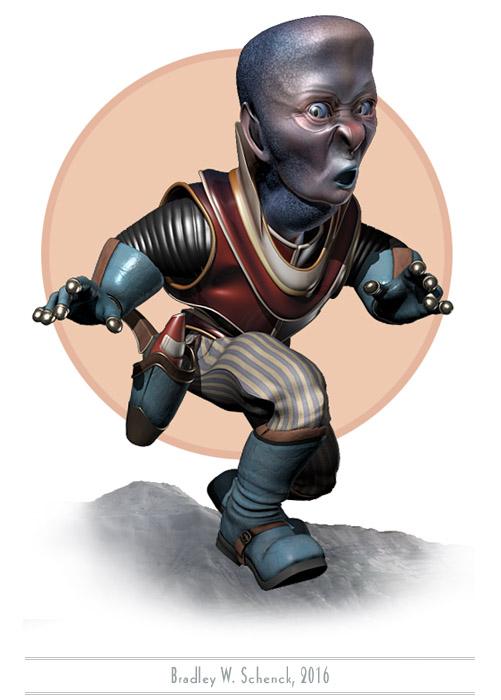
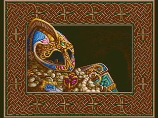
I still don’t have any idea who this is. I can’t help but speculate, though.
I mean, I’ve been wondering a lot about what sort of character he(?) might be even as I cursed myself for working on him/her/it for most of the week when I should have been doing something else. Still – whatever it is – it’s about done, so I should be able to tone down the cursing for awhile.
Fun fact: I added a morph target that I call “Frog Throat”, in which the critter’s throat blows up big like a bullfrog’s. Why? It’s the same old question. I think the answer must be “because”.
I’m sure he/she/it will turn out to be important (maybe even essential!) someday. In the meantime I’ll just keep wondering.
It’s with no small amount of pride that I can now reveal my second, and most successful, human hybrid experiment. I wish I knew exactly what it was; but, as you can see, it’s keeping an eye on us until I figure that out.
Over the past year or so I’ve learned some new tricks with my morph-targeted character heads, and the most interesting tricks are the ones I can play on characters that are already done. Some of this is due to Collapse to Morpher, a very useful 3DS Max script.
Morphs are terrific, but they rely on the source object and its morph targets sharing the exact same topology. That means they need to have the same number of vertices, and (importantly!) those vertices have to be numbered in the same order. If you’re not careful you can end up with two objects that used to share those properties but which now are subtly and fatally different. You just can’t morph them any more.
You can change an object after applying the morpher, and that works because the morphing action takes place before all those changes. But when you do that you end up with a new stack of modifiers on top of the morpher that can’t be collapsed. Every time you make a change to a scene with the modified object present, and in particular every time you change its morph states, all of the post-morph modifiers have to be recalculated in the scene. That slows things down. Slowing things down makes me cranky.
Collapse to Morpher does this crazy, complicated thing in which the entire stack of modifiers is applied to an extracted version of each morph target. Then the morph targets are added to a collapsed version of the original object and then suddenly, or possibly not entirely suddenly, you have a new streamlined version of the object with its new, equally streamlined morph targets, and things are quick again and I’m less cranky.
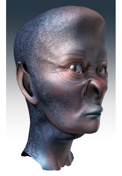
That’s how I’ve worked out ways to blend between two finished character heads, to optimize existing characters, to save time on operations like calculating vertex colors and UV mapping, and – now – to turn a human being into something entirely different.
I did something like this once before. But at that time I didn’t have a practical way to salvage the original morph targets for the character’s facial expressions.
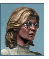
So here’s a little picture of my unwitting experimental subject, Dr. Lillian Krajnik. I started by cloning her (as one does) and then edited her head into the head you see at the top of this post. Once the clone was completely mutated I used Collapse to Morpher to turn it into a new, streamlined character – with all its original expression morphs updated as well. My weird fishy, lizardy human hybrid frowns and smiles and sneers and look surprised, on command, just like Lillian does. Almost automatically.
This stuff is just so cool when it actually works.
I have a little work to do on a few of the morph targets. The nostrils are so different now that any time they rise or expand they behave a little differently, and the eyes don’t close completely as they used to do. But editing that handful of morph targets is so much simpler than starting from scratch, every time.
So now I’m a human hybrid maker. In whatever odd moments I have over the next few months I think it’s going to get all Doctor Moreau in here.
Okay, after my post the other day you may think that I’m spending all my time considering feedback from the Bizarro World version of my editor. Not true!
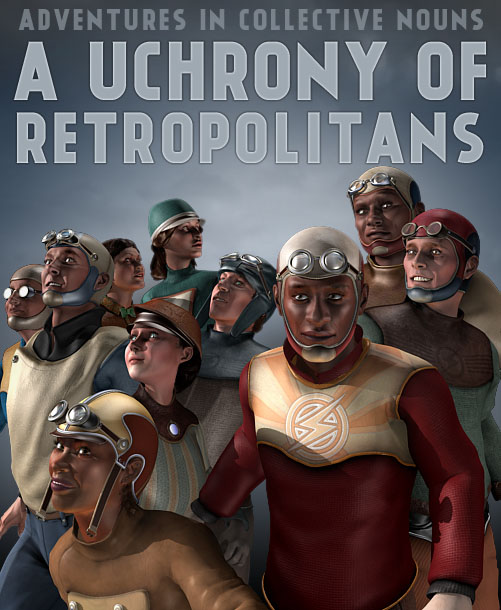
Over the past few weeks I’ve been spending much more of my time on the sort of thing we see here. I’ve been adding to my collection of persons from Retropolis by modeling new characters; I’ve also worked out some tricks that extend the use of older characters. And I’ve done a bunch of them! I left out the imaginary editor you saw in my earlier post because you’ve seen him already, and all that exposure tends to make him more demanding; while another character that I like very, very much doesn’t appear here because he constitutes a spoiler, sort of, and as a result I’m keeping him under wraps.
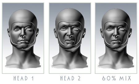
The tricks I mentioned each have to do with the use of morph targets. I use those already for facial expressions, and for parts of expressions, but the first new thing I thought of was to use morphs to combine two existing character heads into a new character. I’ve mixed, say, 40% of Character A with 60% of Character B to get a new head that looks different from either of its parents.
This is possible because all of my recent male heads share the same topology, while all of my recent female heads also share a common topology. (No… sadly, it’s not the same topology as the male heads.)
So I mix the same amounts of two characters, the same way, in every one of their facial variations, and hey presto, new character. I should have thought of this years ago. I’m sure other people have.
This worked really well, sometimes… though not always. Some of these characters have so much personality that they just keep looking like themselves. Still: very neat!
The second trick is even more useful. I do a lot of work on UV mapping on these heads, and although it’s always very similar it’s a thing that’s frustratingly incompatible between models. In addition I calculate vertex colors to accent the creases and hollows in the faces, and that takes about two hours every time I do it.
But I don’t have to! I mean, this was the really clever idea that I ought to have thought of a long, long time back: because I can also morph an old head completely into a new head. My UV mapping and vertex colors remain the same as they were in the earlier character.
I can’t even imagine how much time I’ve wasted by doing those steps manually for every head. It’s a lot of time.
I decided many years ago that a truly lazy person should be willing to work very hard, one time, in order to prevent hard work that has to be done over and over again. I have aspired to be that person. But I see I’m not quite there yet.
Truly, the Way of Laziness is a long and difficult path to master.
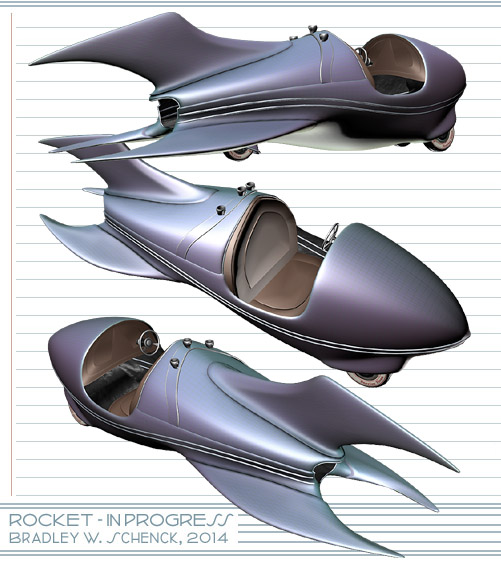
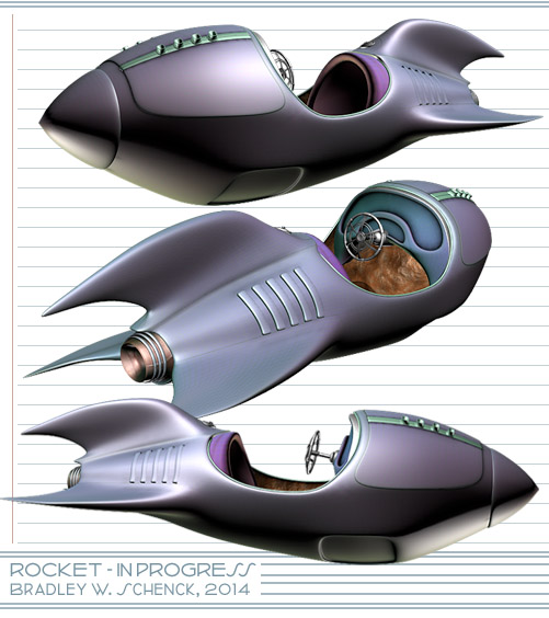
I’m still being irresponsible and devil-may-care, which – since we’re talking about me – means that I’m still sitting in a dimly lit room while I build retro rocket models. This one, as untextured as the last, is more of the same.
Each of these September models is a variation on an iconic shape that I’ve played with before; but that was several years ago, with lower resolution on all fronts. These stand up much better in close-ups. Even their temporary textures are laid out at a higher resolution and so have a higher pixel density in the end product. I call that progress of the software-straining, RAM-chewing variety.
I’m expecting some news at the end of the week which, whether it will be good news or bad, seems to be distracting me. You know that thing that happens when you hear a high-pitched whine dopplering in from overhead, and you’re not sure whether it’s a drone delivery of some Really Cool New Thing, or a nuclear missile? It’s like that. Therefore, rockets.
So after months of nearly nonstop picture-making for Slaves of the Switchboard of Doom I’m taking a short break before I start weeks of picture-fixing for the same thing, and with the same pictures. Because the whole weeks/months issue gets a little wearing, no matter what the work’s for, and it’s almost always more fun to build stuff than it is to turn that stuff into pictures.
So I’m modeling a rocket. You can’t go wrong with rockets. And it’s been quite a while since I built a new one.
Like most of my rockets, this one’s in the style of the personal rocketing devices we first saw back in the late 1920’s, in the earliest pages of the Buck Rogers comic strip.
Those open-cockpit flying roadsters were not much like the real rockets we came to know (and often fear) a decade or so later. No, these are "rockets" in the sense that they’re flying vehicles whose workings are mysterious to us, but which ought to look something like this.
You ask me, they still ought to.
Anyway, this one needs more surface detail, especially on the dashboard, and actual materials before I’ll use it anyplace. But it’s ready for those finishing touches whenever I figure I need it. Truth to tell, I should probably be adding to my library of Retropolitan buildings instead; but I just felt like making a rocket. So there.
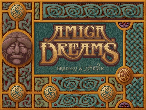
Back in September of 1987 I bought my first Amiga computer. It was an Amiga 500 – the least expensive Amiga, but with a whole megabyte of RAM. Less than a year later I’d use it to win the BADGE Killer Demo Contest, whose first prize was an Amiga 2000.
In the Fall of ’87, though, that was still a ways off. A long ways, as far as I could see: because although I wanted make pictures and animations, I was having some trouble learning to draw with a mouse. So I sent some of my pencil sketches off to a service bureau, where they were digitized with a video camera, after which I planned to paint them on my new computer. But before the scanned images came back I went to an eye-opening presentation by Jim Sachs at AmiExpo. Jim was doing fantastic artwork… and all of it with a mouse.
So I returned home and went back to drawing with what felt like a small brick, and I’d gotten the hang of it by the time my digitized sketches arrived, in the mail, on a floppy disc.
In October and November I got pretty busy with my mouse and Deluxe Paint II – and my scanned sketches – and I turned out a bunch of pictures. I put them all together with a shareware slideshow program, and zipped them up, and uploaded the slideshow to BBS systems across the country. Because that’s what we did in 1987, with our modems. On our landlines. After walking six miles through a snowstorm.
The Amiga Dreams slideshow was a portfolio that I used to approach game companies. It spread pretty far across the BBS’s and it introduced me to a whole lot of people, some of whom I still know.
I recently ran across a copy of the original slideshow at Aminet and I downloaded it. (I didn’t even have a complete copy any more.)
Now, it’s hard to simply show you the original images – mostly in 16 or 32 colors – because the aspect ratio of the Amiga’s pixels was different from the square pixels that computers use today. I had to scale these to get the images themselves into the correct aspect. So what you see here isn’t a literal version of what I did then, but the pictures look the same.
Treasure (1987)
These days, people call this "pixel art" – which is a pretty silly label – because one often worked with individual pixels, in solid colors, and from a limited palette. I used to say that I knew all my pixels by name. I almost wasn’t kidding.
Like most of the Amiga Dreams pictures the original resolution of the one above was 320 by 400 pixels, and I painted it with a palette of 32 colors. It was based on a little pencil sketch from my sketchbook.
The North Light (1987)
Here I took an old drawing for a watercolor and painted it over again in Deluxe Paint. This one was also 320 by 400 pixels. You can see that I managed pretty decent gradients for the sky and the beam of light; but it cost me quite a few of my 32 colors.
Lady Otway (1987)
Part of this picture was originally a pen and ink drawing.The digital version became better known a year or so later when I did a new, expanded version (in portrait aspect) for the cover of Amiga World magazine. Once again, this one was 320 by 400 pixels in 32 colors.
To do the portrait aspect version I rotated the image 90 degrees and turned my video monitor on its side. The monitor wasn’t too happy about that, but it was nothing a little degaussing couldn’t cure.
Tower (1987)
The Amiga’s Hold and Modify graphics mode was made up of equal parts of inspiration and dementia. You could use up to 4096 colors, but the color values were stored as the difference between the current pixel and the pixel to its left. Because the early Amigas used video displays there were limits on how many of these changes could happen on a given scanline, and how large the color changes could be from one pixel to the next.
If you used a HAM paint program you had to deal with strange color fringes shooting off to the right while you worked. This caused undesirable mental effects in laboratory mice, and in me.
I almost never painted in HAM after this one. HAM turned out to be great, later on, for 3D rendering, or for images that were painted in 24 bit color and converted down. But painting in HAM? It was possible: I just never liked it. I painted this picture in HAM with Digi-Paint.
Interesting note: another HAM paint program showed up a few years later. It was called Photon Paint, and it was written by the young Oren Peli – better known in this century as the writer/director of Paranormal Activity. It’s a small world.
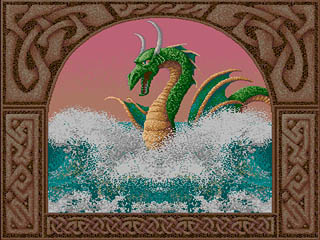
Serpent (1987)
I can’t quite remember the provenance of this one. It’s possible, and maybe even likely, that this was the first thing I drew from scratch with a mouse. The original was once again 320 by 400 in 32 colors.
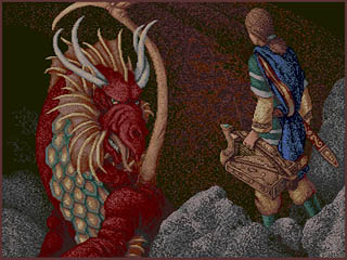
The Dragon (1987)
Here’s another 32 color image, this time based on a couple of my pencil sketches. My original drawing of the dragon turned into a forgettable oil painting: I think it’s better off here.
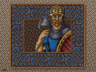
The Viking (1987)
This picture’s claim to fame is that it was the beginning of a dithering technique I finally mastered in the following year (more here).
At 640 by 400 pixels I could only have a 16 color palette. So I used part of that palette for a range of warm greys, and the rest for hues.
I used these colors in a checkerboard dithering pattern: the greys for values, and the hues for color. It worked pretty well, especially on a video monitor where the alternating pixels tended to bleed together. Here’s a literal detail at twice its original size.
In practice, I painted areas with solid hues and then drew diagonal grey lines through them. I’d go over the grey lines with lighter and darker greys, either pixel-by-pixel, or in shorter diagonal lines. I also defined checker fill patterns with the 50% grey and one color, filled an area with that pattern, and then retouched the values from there.
The reason this all seemed worth it? Resolution. A 320 x 200 or a 320 x 400 image had big, visible pixels. At 640 by 400 I managed to get cleaner lines with the illusion of a large palette of colors.
The End (1987)
And this was the end, of course, in a Celtic knotwork border. I had pages and pages of knotwork designs for my drawings and paintings, earlier in the decade: I turned a lot of them into Amiga graphics in limited palettes, as we see here.
Years later, when I was building my first web site, I turned many of my early Amiga knotwork patterns into web-friendly clip art; those pages are still up. There’s even an animated Celtic knot that I painted in 1988 for the Charon demo that won me my second Amiga.
So these are my very first computer graphic images. It’s strange to see them again. Things were so different in 1987 that it seems like somebody else’s ancient history. I can’t even recall what treasures I myself found through the BBS systems of the day; there was wonderful art and freeware and shareware. It was a pre-web world, but our data still got around.
And I haven’t even mentioned the computer user groups, like VAUX, SFVAUG, and the others I used to visit, back when using a computer – or a particular kind of computer – made you an honorary member of unsecret societies across the globe.
BasRel v1.0 is a plug-in for 3dsMax (2013 only, apparently) that uses the renderer’s z depth, or depth mask, rendering to produce height maps you can use to plot out CNC-routed bas reliefs from 3d scenes.
That might sound like a simple function until you realize that the depth information needs to be rescaled and modified to create the illusion of depth and additional shading in the shallow environment of a bas relief. It’s a fascinating idea of the kind that leads to other fascinating ideas, mainly of the “Hey, I could do this…” variety.
Or, anyway, that “One could do this…”, seeing as how I don’t have a supported version of Max. It’s still pretty dang interesting, if in a sort of abstract way..
The web site is unfortunately pretty confusing. The original incarnation of this idea used Blender, and most of what you find on the site relates to that application and – I think – a series of tutorials that help Blender users build their own copy of a plug-in, at which point there’s a bunch of post work in Photoshop or another paint program. Like I said, it’s a bit confusing.
The results do look very neat. I can imagine all sorts of ways to use a process like that, if I had a supported version of Max, anyway. Below is a video for the Max 2013 plug-in; I have no idea what’s going on during the multiple renderings and whatnot. Still, very neat. They’re getting a lot of detail out of Max’s depth maps (which I’ve found to be a little twitchy, myself).
There would have to be some limitations: since the resulting image(s) is (are) based on the depth map then the process is best suited to very high resolution models without things like opacity maps, bump or normal maps, and so on. And I’ve got no idea how one would get the data prepared for CNC work, which I think involves cutter choices and cutting paths. Chances are that’s just one of the many things that the web site doesn’t explain clearly enough for your humble correspondent, who’s now degrading to the “Get off my lawn!” stage of his development, oddly in the third person. Oddly, certainly.
What began as a frenzied effort to make a bunch of characters that I can use in crowd scenes for both The Lair of the Clockwork Book and The Toaster With TWO BRAINS has unexpectedly turned into a whole new character creation process and, along the way, a whole new generation of character models. I’m excited about this even though I continue to worry about my Thrilling Tales schedule.
Because the object structure of my male heads is different this has meant repeating a lot of the setup work I’ve done for my women. But I’ve also done something new and neat that nearly works as planned – more on that below.
It started during the summer with tasks that I sprinkled in between my Clockwork Book illustrations. I created a series of very low resolution clothing objects and used Mudbox to sculpt them into much higher resolution models. Then I exported them in high and, um, less high versions. I completed the materials and textures on the high resolution models, then baked that texturing and the higher res normals into my medium res objects. (I did this in two different image resolutions, so I could switch between textures depending on how large a character appears in a scene).
Since then I’ve been working on new character heads that use morph targets for their expressions. More importantly, though, I’ve been working on the process for creating those heads so that it’ll be much easier to make new ones now, and the results should be much better.
A morphing character head consists of a base object – the head in a neutral state – and a bunch of other variations on it with expressions or other changes. So long as the structure of all these heads is exactly the same you can dial up one expression or another on the neutral head. In effect you have a single head that you can vary as needed.
Some of the things I’m doing involve changes to the objects. The simplest of those is lowering their resolution. Now, making changes to morphing objects is extremely tricky. You have two choices: either apply those changes to the neutral head after the morphing modifier – which is perfectly safe – or apply the exact same changes to every version of the head before the morphing modifier. Some modeling changes just can’t ever work on the raw targets. Some work most of the time. Some seem to work all of the time. As I work on my modifiers, I have to test them repeatedly. And it’s also important that these changes will work in the same way on every new head I make.
But the results are worth it: ideally, I can create any male character head and apply the exact same changes to it. After all that initial work what I have is a much more streamlined system to use over and over again.
Like I said, polygon reduction was the main thing I was interested in – but as of this morning I have a usable system for doing something completely different.
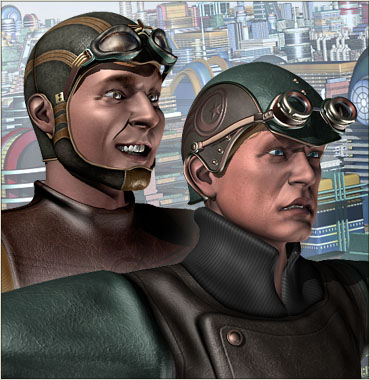
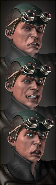
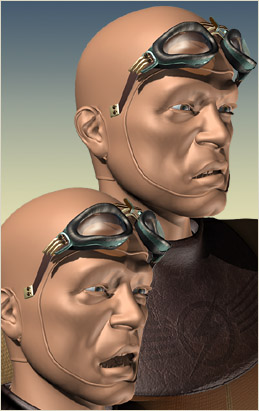
Switching to morphing heads makes some things more difficult. In the past I designed a style of headgear that’s very common in Retropolis: a kind of form-fitting cowl, like an aviator’s helmet, that hugs the head and wraps around the chin.
When my characters were moving their heads and faces through bones, this was no problem. The cowl would be skinned to the same bones as the face and so it would move as the face moved. But the switch to morph targets meant that couldn’t work any more. The entire face would be moving in a way that the cowl couldn’t follow automatically.
So what I set out to do was to create an object modifier that would cause the cowl to grow out of the head. However the head moved, the cowl would grow out correctly because it would always be based on the current state of the head – and remember, that ought to be any head. By doing it this way I could apply the cowl to all the morph targets, if I liked – they’d still have an identical structure once this same change was applied to all of them. But along the way I thought of something much smarter.
By adding the cowl modifier after the morph takes place I could have my morphing character with headgear; if I turn off that modifier, though, I have the exact same character without the headgear. Slap some hair on the head and I’ve got my guy both ways.
And it almost works perfectly. I’ve been referring to my cowl-growing process as "a modifier", but in fact it’s two modifiers that get applied in sequence. There’s still something wrong when I apply the second one – I’m finding that I have to finish the process by hand, once, for each new character. But even if I can’t sort out that problem I have a nearly automatic process for growing a Retropolitan aviator’s cowl right out of any new male head I make.
Sometimes, I feel really smart. This is almost one of those times.
Now I just need to crank out a few more of these guys before I have to go back to work on the last of the illustrations for The Lair of the Clockwork Book. There aren’t as many to do in this batch, but I know they’re going to be difficult ones. So, you know, I worry.
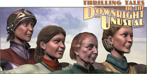
Well, it’s not really all about the ladies; but they’re what I had to drop into this picture.
During this round in which (theoretically) I’m working on Part Two of The Toaster With TWO BRAINS (while also catching up on a web project) and in which (actually) I’m building character assets like mad because I need so many folks in the background for upcoming scenes not only in TWO BRAINS but also in The Lair of the Clockwork Book, while still, truly, catching up on that web project, and – as I see with some dismay – constructing overlong sentences that just won’t die, I have been practically incommunicado because my nose is pressed so firmly into my monitor.
But I’ve done great, though undetectable, things: I’ve completely revamped my work flow for creating female character heads, with much greater controls over their expressions, and every one of these new heads uses the same object topology so that if I really wanted to, I could probably morph them from one character to another. This involved some difficult work over five days – not counting making the actual heads you see here – but it’s the kind of thing that will continue to help me out in the future. The new system worked so well that I even rebuilt my Gwen Hopkins character’s head completely from scratch, since she has a lot of upcoming scenes in TWO BRAINS.
Male heads, on the other hand, are still ahead of me; I have to redo that preliminary work for them because their object topology will not be the same. But happily I still have the original (though incompatible) data for Nat Gonella’s head, and I’ll eventually be rebuilding that one with the new system, too.
But it’s not all about the heads. I’ve also finally done some 3D sculpting work that I actually like for clothing. I’ve turned out a bunch of different base garments and a number of texture variations on them, with more to come, so that you won’t think everyone in Retropolis shares the same clothes. This new approach involves high and low resolution versions of the garments, where I’ve built them completely in the higher resolution and then baked their textures and normals into low resolution versions of the same clothing. I’ll even have the higher resolution clothes there for use in some of my really large renderings.
So this period of a few weeks is just about all concerned with what, in a perfect world, would have been pre-production. I just don’t have the luxury of doing all that work at a more sensible time, when I’m not still under the evil eye of my schedule. Because for as long as I’m doing a serial I am always under the schedule’s evil eye.
The bothersome thing is that this work – though it will benefit TWO BRAINS – is coming out of the TWO BRAINS part of my schedule. The publication schedule for the Clockwork Book makes it a cruel master.
I just need two of me, I guess.
Anyway, it’s back to more of the same and some other stuff. I ought to get back to The Clockwork Book in a month – it would be better to do that even sooner. In the meantime, I’m an asset building machine.
Made as the filmmakers’ final project at the Utrecht School of the Arts, Blik is a story told entirely without dialogue and – because the characters’ faces lack any features – without the use of any expressions at all. The whole thing is done with an exacting use of body language and as challenging a prospect as that is, these folks (now at Polder Animation) pull it off brilliantly.
There’s something very pleasant about their combination of watercolor-like rendering and their use of light, shadow, and – at one point – rain. Very nice work!
[tags]computer animation, short film, polder animation, utrecht school of the arts, rendering[/tags]
My money's on the Stay-Puft Marshmallow Man.
(link),Jan 20
RT @WardQNormal: The trouble with conspiracy theories is that a lack of evidence is not taken as proof it's not real, but instead as proof the conspiracy is indeed everywhere. This is like thinking that the reason you never see elephants hiding up in treetops is because they're good at it.,Jan 12
Publius Clodius was a populist demagogue in the late Roman Republic. He knew how to whip a mob up into a frenzy, but he wasn't clever enough to use them effectively. He failed.,Jan 7
One of these seems to say "Come on down!" (link),Jan 7
Just a reminder that I still have a bunch of old original art for sale. These all come to us from the 1980's, with drawings from The Runestaff, the Leslie Fish/Rudyard Kipling Cold Iron songbook, The Folk Harp Journal, and more.
(link)(link),Jan 14


 tended to bleed together. Here’s a literal detail at twice its original size.
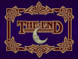

 It started during the summer with tasks that I sprinkled in between my Clockwork Book illustrations. I created a series of very low resolution clothing objects and used Mudbox to sculpt them into much higher resolution models. Then I exported them in high and, um, less high versions. I completed the materials and textures on the high resolution models, then baked that texturing and the higher res normals into my medium res objects. (I did this in two different image resolutions, so I could switch between textures depending on how large a character appears in a scene).
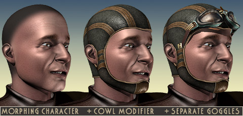
 By adding the cowl modifier after the morph takes place I could have my morphing character with headgear; if I turn off that modifier, though, I have the exact same character without the headgear. Slap some hair on the head and I’ve got my guy both ways.
 them from one character to another. This involved some difficult work over five days – not counting making the actual heads you see here – but it’s the kind of thing that will continue to help me out in the future. The new system worked so well that I even rebuilt my Gwen Hopkins character’s head completely from scratch, since she has a lot of upcoming scenes in TWO BRAINS.
 Made as the filmmakers’ final project at the Utrecht School of the Arts,