My money's on the Stay-Puft Marshmallow Man.
(link),Jan 20
RT @WardQNormal: The trouble with conspiracy theories is that a lack of evidence is not taken as proof it's not real, but instead as proof the conspiracy is indeed everywhere. This is like thinking that the reason you never see elephants hiding up in treetops is because they're good at it.,Jan 12
Publius Clodius was a populist demagogue in the late Roman Republic. He knew how to whip a mob up into a frenzy, but he wasn't clever enough to use them effectively. He failed.,Jan 7
One of these seems to say "Come on down!" (link),Jan 7
Just a reminder that I still have a bunch of old original art for sale. These all come to us from the 1980's, with drawings from The Runestaff, the Leslie Fish/Rudyard Kipling Cold Iron songbook, The Folk Harp Journal, and more.
(link)(link),Jan 14
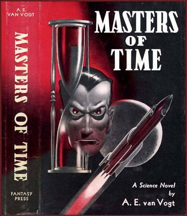
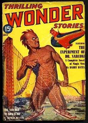
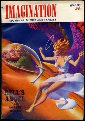
Although it seems quiet on the blog front, as usual that just means I’m raising dust and pushing pixels elsewhere.
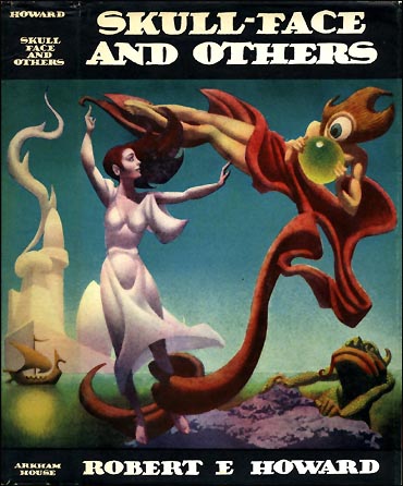
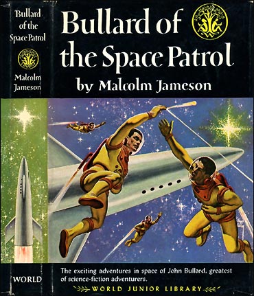
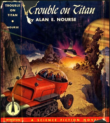
But while I’ve been stapled to something entirely different, the unsleeping scanner of Mister Doortree at The Golden Age has been treating us all to some wonderful old dust jacket and cover art from mid-century science fiction and fantasy. There’s a smörgåsbord of cover art in every link! To wit:
I’ve just run across this PDF version of an article about me from the July 1994 issue of the IEEE’s magazine IEEE Computer Graphics and Applications. There are a few little inaccuracies in there (there always are) but on the whole Karen Whitehouse did a pretty creditable job of trying to make sense of me and my work.
My apologies for the quality of these images: they’re taken from the PDF, which was scanned from the magazine.
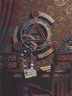
The picture above (adjusted here to correct its aspect ratio) was an example of a dithering technique I used in the late 1980’s, using just 16 colors to create the illusion of a much broader palette. I never used it for anything that was published – except in this article, I guess – and the technique had already become obsolete by the time the article appeared. Still, that’s one of the things I’m proudest of from my early days in computer graphics. Dan Silva, the programmer of EA’s Deluxe Paint, sort of shook his head in disbelief when I showed him how it worked.
At left you can see a concept image for a game project that might have followed The Labyrinth of Time, had we come to terms with EA or another publisher.
I recall what we meant to do, and how we meant to do it, so I have a feeling that we’d have bogged down on the new character methods we had in mind. Character heads would have been scanned from clay models, and what I didn’t fully dread at that time was how messy and unusable those 3D scans would have been.
Still… it sure would have been neat.
For myself what astonishes me about the interview is that even though (I think) we conducted it over the telephone I seem to have managed complete sentences and a couple of quips.
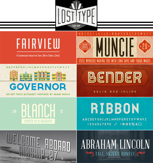
The Lost Type Co-Op is a group of typographers who sell their fonts directly to the customer through their web site, using a pay what you want model. The emphasis is on retro and industrial fonts and typefaces based on mid-twentieth century signage, and they’re awfully nice.
So nice that I’d like them all, in fact.
In most cases, you pay whatever you like for an unrestricted license. In a few cases there are tiers: so much for personal use, so much for commercial use. Licenses for web use as a font-face vary from one to another and are indicated by a distinctive graphic. Lost Type itself just passes the money on to the individual typographers; it doesn’t make any money on its own behalf.
I ran across their site while following a Twitter link that mentioned my Pulp-O-Mizer, and I stayed because, well, I couldn’t help it. There’s some really lovely work here, and the stories behind some of these faces are pretty interesting, too: for example, how a walk through San Francisco’s Mission District led to the creation of Mission Gothic.
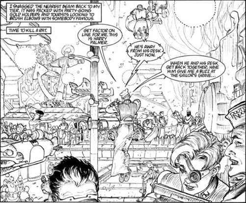
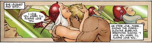
The Kickstarter project for Michael Kaluta and Elaine Lee’s continuation of their Little Nemo-meets-Metropolis story Starstruck has met its goal, which ensures (at least) a black and white edition of the graphic novel: but with less than two full days to go they’re still a bit shy of the full amount they need to produce the book in color.
Which means that it will look as good as the panel above, and it might look as… as even better as the panel below.
So I’m doing this thing on Kickstarter, as you may have noticed, and that means I’ve spent some time there over the past few days and, being there, I’ve paged through a bunch of other peoples’ current projects. This one slapped me right upside the head: Michael Kaluta and Elaine Lee are crowdfunding a sequel to their Starstruck comics from the 1980’s in a 176 page graphic novel format. If this team needs any introduction, the blame falls on you.
I’ll just mention "science fiction" and "noir" and "freaking Michael Kaluta" to get you started.
If the project meets its $44,000 goal the book will be published in glorious black and white; that’s not ironic, which I mention for the benefit of anybody who hasn’t seen Kaluta’s inks. But if they meet their stretch goal of $69,000 they’ll be able to add color to the pages, which would also be pretty wonderful.
As I write this the project is nearing the $36,000 mark and it’s still got 24 days to run. So I’d say they’re pretty much on track for one wonderful thing or the other.
Over the past year or so we’ve seen Kickstarter used in ways that don’t always warm my heart; that Veronica Mars project, for example, just looked like a way for a major studio to produce a film (and, they must have assumed, its buzz) without ponying up any cash for it, thereby increasing their profit margin. That doesn’t thrill me. But seeing individual creators of this stature go straight to the public to fund an independent project… it’s happy-making. Go check it out.
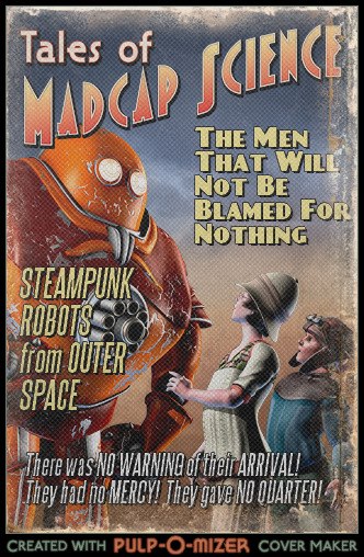
The UK Steampunk band The Men That Will Not Be Blamed For Nothing is sponsoring a contest for their Facebook watchers using the PULSATING POWER of the PULP-O-MIZER.
Through Friday, by which I mean Friday in Old Blighty, they want you to post a Pulp-O-Mized advert for the band. You can see the details on their Facebook page where they’ve announced that prizes will include two tickets to their show in London on April 27, plus some other things that may include posters, CDs, and T-shirts. And awesomeness.
Every game developer and her nephew seems to be riding on the coattails of Double Fine Adventure these days with Kickstarter-funded adventure games; Jack Houston and the Necronauts is no different, in that way, while it’s extremely different in another way or three.
Its setting makes it kind of a natural for me, to start; the lantern-jawed Jack Houston arrives on swampy, creature-infested Venus only to be wrecked there, and to slumber for a thousand years in the very best traditions of the service.
Where it gets really odd, though, is in the game’s development and presentation: they’re building miniature sets and animating the game characters with stop motion animation.
I’m still marveling and wondering about that one. It’s a really interesting choice that – for a point and click adventure – might just work, in another longstanding tradition (this time, Terry Pratchett’s) of million to one chances. Very interesting.
It seems like a somewhat risky proposal since the budget is by no means high. But what an intriguing concept!
These days I’ve been watching Kickstarter denizens with a little puzzlement, myself, though I do understand their issues. But it seems odd that Kickstarter projects are increasingly viewed less as a way to help the development of something neat, and more as a way to shop for something that is certain to exist.
It’s illuminating (if strange) to read some of the comments of people who’ve arrived at Kickstarter this year. They have preconceptions like "The rewards should give backers a chance to get the XXX for less than a normal customer would pay", for example, which really flies in the face of what it takes to develop small, initial amounts of, well, anything. There have been some interesting conversations at Comics Worth Reading and The Beat – though those are concerned with comics projects, with a possible side dish of games – and in reading some of the comments I end up feeling like an anthropologist lost in the Amazon, peering at the natives and trying to jot down meaningful notes about their quaint and curious customs. Which, honestly, is how I feel most of the time anyway. But still.
[tags]jack houston and the necronauts, adventure games, kickstarter, stop motion animation[/tags]
BasRel v1.0 is a plug-in for 3dsMax (2013 only, apparently) that uses the renderer’s z depth, or depth mask, rendering to produce height maps you can use to plot out CNC-routed bas reliefs from 3d scenes.
That might sound like a simple function until you realize that the depth information needs to be rescaled and modified to create the illusion of depth and additional shading in the shallow environment of a bas relief. It’s a fascinating idea of the kind that leads to other fascinating ideas, mainly of the “Hey, I could do this…” variety.
Or, anyway, that “One could do this…”, seeing as how I don’t have a supported version of Max. It’s still pretty dang interesting, if in a sort of abstract way..
The web site is unfortunately pretty confusing. The original incarnation of this idea used Blender, and most of what you find on the site relates to that application and – I think – a series of tutorials that help Blender users build their own copy of a plug-in, at which point there’s a bunch of post work in Photoshop or another paint program. Like I said, it’s a bit confusing.
The results do look very neat. I can imagine all sorts of ways to use a process like that, if I had a supported version of Max, anyway. Below is a video for the Max 2013 plug-in; I have no idea what’s going on during the multiple renderings and whatnot. Still, very neat. They’re getting a lot of detail out of Max’s depth maps (which I’ve found to be a little twitchy, myself).
There would have to be some limitations: since the resulting image(s) is (are) based on the depth map then the process is best suited to very high resolution models without things like opacity maps, bump or normal maps, and so on. And I’ve got no idea how one would get the data prepared for CNC work, which I think involves cutter choices and cutting paths. Chances are that’s just one of the many things that the web site doesn’t explain clearly enough for your humble correspondent, who’s now degrading to the “Get off my lawn!” stage of his development, oddly in the third person. Oddly, certainly.
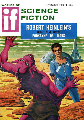
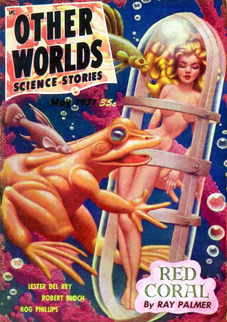
Over at the Golden Age Comic Book Stories blog we see a collection of "Worlds of IF" covers from the 1950’s and the 1960′s, by a smorgasbord of illustrators including a few by Virgil Finlay, and what seems to be a posthumously published cover by Hannes Bok.
In fact I wasn’t positive that the publication date was, you know, after Bok’s expiration date, and when I went looking to verify that I ran across this small archive of his work. It includes the one I’ve reproduced below.
Frederik Pohl posted some of his reminiscences about Bok last year. You can read those here and here.
The 50’s and 60’s are actually a little too modern for me, for the most part, but I’m always ready for a little Finlay or a bit of Bok. I’m often bemused by the fact that the long, odd trip I’ve taken with my own work has led me back – by a route that’s anything but direct, and which couldn’t be called intentional – to illustrators like these, whose work I enjoyed so very much when I was young. It’s all a bit like a joke that I wasn’t in on, or the end result of a convoluted plan by some cackling archvillain.
[tags]worlds of if, golden age comic book stories, virgil finlay, hannes bok, other worlds, science fiction, illustration, 1950s, 1960s[/tags]
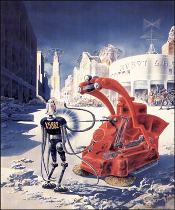
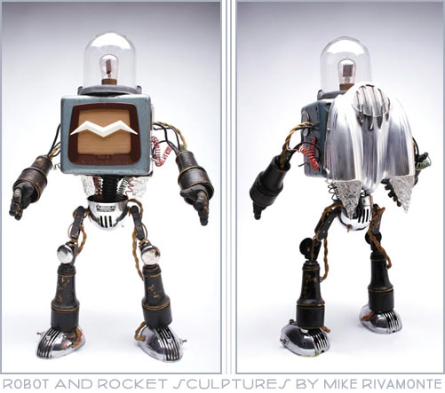
There’s just something about assemblage sculpture of robots, in which the artist picks from the cast-off streamlined spare parts of yesterday and makes something entirely original – though not entirely new – out of those old gauges, speaker grilles, canisters and vacuum tubes. Like I say, there’s just something about them and that something never fails to make me smile.
These are just a couple of pictures of Mike Rivamonte’s assemblage sculptures. My favorite listed component (so far!) is "Australian drive-in speaker". Because the dedicated roboticist will go straight to the Antipodes for his diodes.
There are also rockets, including some resin-cast versions, listed on Rivamonte’s home page, and for those of us with more appreciation than ready cash there are some awfully nice prints, too. Wonderful stuff!
[tags]robot, rocket, sculpture, assemblage, vintage, retro, mike rivamonte[/tags]
My money's on the Stay-Puft Marshmallow Man.
(link),Jan 20
RT @WardQNormal: The trouble with conspiracy theories is that a lack of evidence is not taken as proof it's not real, but instead as proof the conspiracy is indeed everywhere. This is like thinking that the reason you never see elephants hiding up in treetops is because they're good at it.,Jan 12
Publius Clodius was a populist demagogue in the late Roman Republic. He knew how to whip a mob up into a frenzy, but he wasn't clever enough to use them effectively. He failed.,Jan 7
One of these seems to say "Come on down!" (link),Jan 7
Just a reminder that I still have a bunch of old original art for sale. These all come to us from the 1980's, with drawings from The Runestaff, the Leslie Fish/Rudyard Kipling Cold Iron songbook, The Folk Harp Journal, and more.
(link)(link),Jan 14