


Having finished the redesign for my Retropolis site, it was much simpler to make the same changes to The Celtic Art Works. The two shops are built in a similar way: for the most part I’d solved all the problems already.
Okay, they’re not exactly the same. I had several surprises along the way. Still, this shop took about half as much time as the first one.
When I posted about the Retropolis redesign I described it as “phone-friendly”, but I never explained what I meant by that.
It seemed ridiculous to maintain two separate versions of these shops, one for desktops and one for smaller displays. I’ve always thought that was a pretty terrible solution.
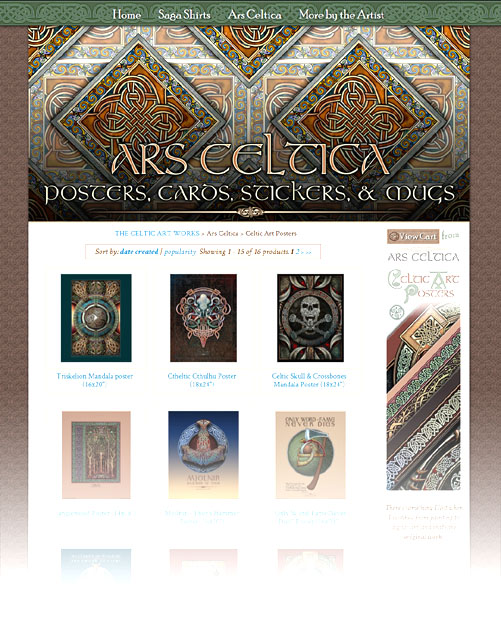
If you view either site on a desktop computer you can see what I’ve done by resizing your browser window, from full screen to just under 400 pixels wide.

You can use CSS to wrap the elements differently at different widths, but there are design limits when you rely on CSS alone. So I made things a bit more complicated.
First, I do the obvious by checking the width of your browser’s window when the pages load – but there’s also a Javascript listener that watches for changes in the browser’s width. Those changes kick off a function that hides some screen elements and reveals others. This works equally well on any platform and also allows the layout to change when a phone or tablet is rotated.

That allows the site to use more than just CSS to move the elements around. If your window’s wide enough (as in the first image), you get a large, fixed-position menu at the top of the page and a sidebar on the right; on smaller displays the wide menu gets hidden, a narrower one is revealed, and the right-hand sidebar is replaced by a copy down below. (Most of that’s shown in the second and third images.)
Because I can make different changes at a variety of widths I’m able to get a pretty good looking layout at almost any size.
Finally, I go through a little dance to adjust the height of the sidebar when it’s visible. You can’t check the height of a floating element in Javascript – ouch! – so I have to check the position of the footer to figure out how tall the sidebar needs to be. That’s the kind of thing that’s automatic when you lay a page out with tables, but ends up being difficult with CSS.
The redesign has a problem with wide left-side content when the sidebar’s visible. So on a few pages I’ve always hidden the sidebar and revealed the lower copy.
Anyway, as I said you can play around with this by resizing your computer’s browser window. I can’t promise hours of fun, but it may be kind of interesting to see the layout change at different widths.
Oh! And consider buying something while you’re there, right?