


If you were following along a couple of months ago, you probably know that at that time I was working on the dust jacket art for my book Slaves of the Switchboard of Doom.
I couldn’t show it to you back then. That’s because the auspicious moment for a cover reveal is determined during ancient, eldritch rituals around the smoking braziers and in between the ragged and unsettling tapestries of the towers that brood over the isle of Manhattan.
Yeah, that’s really how they do it. They’re old school, over there.
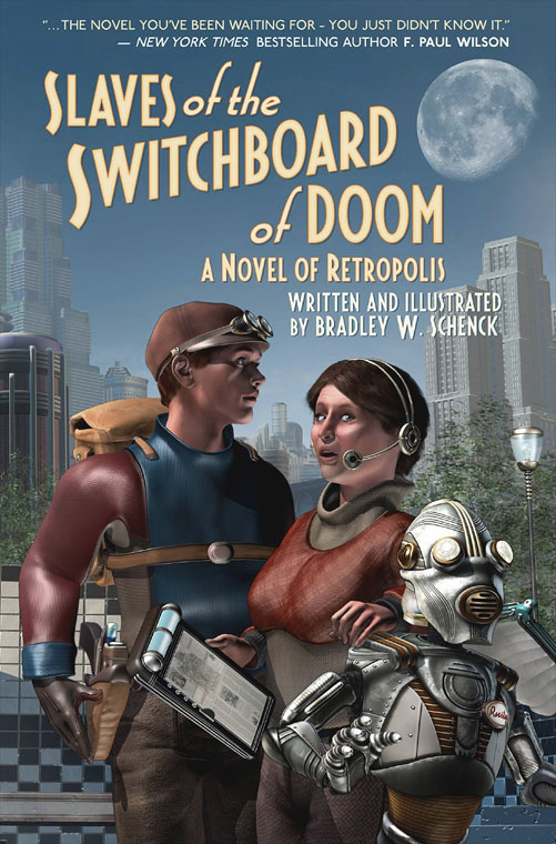
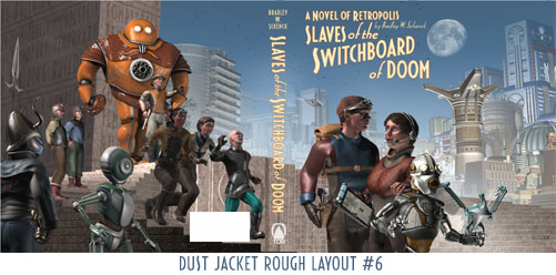
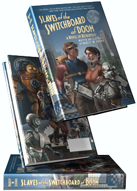
But last week my editor showed off the front cover and wraparound versions of the dust jacket. So here it is – front cover above, and the whole dust jacket below.
The Old Cover
If you’ve been following along even longer you may remember that I did a cover design for the book, back before it even was a book. It looked like this:
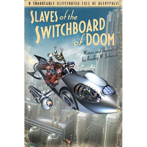
I really liked the vintage paperback palette and the detail of Rusty hanging on to the rocket in a kind of homage to Josh Kirby’s Discworld covers. But I also figured that if a publisher wanted the book, some other artist would end up doing the cover… because cover art is another matter that’s decided during those archaic festivities that I mentioned above.
So I was happy to learn that even though Tor didn’t want my original cover, they did want me to do a new one.
The New Cover
In March I got a rough description of the cover they wanted, and that’s more or less what you see on the front.
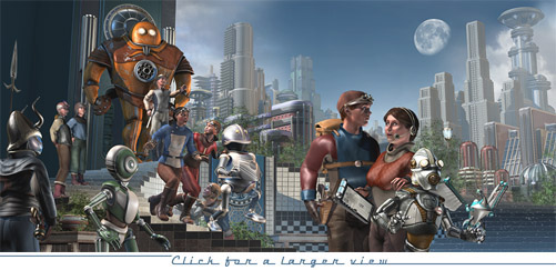
But because it was to be a wraparound jacket I had all sorts of room to show the rest of what they wanted, which was the city of Retropolis; and I took advantage of the situation by doing on the back cover what I really wanted to do: a whirlwind of characters in another light homage to Josh Kirby.
Because nothing says ‘humor’ better than a crowd of frightened people who are running for their lives.
But, hey, I’m getting ahead of myself.
The Roughs
First I worked up a series of roughs: there were six of them. Like most of what I do, these roughs started in 3DS Max and were finished (rather lightly, for the roughs) in Photoshop. They were very, very preliminary.
For complicated reasons it seemed like it would be better to offer fewer choices than that, so I cut it down to two. Of those two they picked the rough that I liked best. You can see that one below.
And although I didn’t realize it at the time, that rough is the cover you see now at Amazon, and at Barnes & Noble, and everyplace else where the book’s mentioned. Now that the cover’s been revealed we should eventually see the real cover show up in all those places. I’m eager to see that happen.
The Layers
At the rough stage I still had no idea what my polygon count would be in 3DS Max. (Over seven million!) But it was obvious that I’d need to handle the scene in multiple layers. In the end, there were at least six of these layers. (It’s hard to be exact, because there were problems that showed up only when I’d rendered the scene at a high resolution – so I went back, near the end, to render out my fixes for those.) At the very end I put all the layers together in Photoshop, where I did all kinds of retouching on them until they were a picture.
The biggest single task was the city in the background. For the rough I’d just pasted in bits and pieces of my existing city backdrops to get the building masses about where I wanted them. For the final I had to model new buildings and arrange them all into a layout that made sense. So of the six weeks I spent on the picture, I spent two in the city.
Lighting is always a large task, and here I was lighting about six separate scenes that needed to match. I know this sounds simple: but this isn’t photography. I’m not documenting. The lighting all had to look correct, but in fact it’s subverted and bent in countless ways that better serve the picture.

The simulation above doesn't really show you what I was working on; I often went forward and backward through the layers, and as I worked, of course, I hadn't done any retouching. But you can see what pieces I was working on, even though they look much prettier here.
The Big Picture
Finally, while the dust jacket is large - it's about twenty-one inches across - I wanted it to be even larger. So at its full resolution the picture will become a poster and an archival print at about thirty inches by fifteen.
 I really enjoyed working on this, which is a strange thing to say about six weeks of incessant minor changes and test renderings; but there it is.
The dust jacket is a set of panels that have to work together as a single picture, but which also need to stand on their own when they’re seen on the book: the front and back flaps, the front and back covers, and even the spine will be seen as separate pictures once the dust jacket is folded around the book. It’s a really interesting challenge.
And that set of pictures has to show the shopper what the heck this book is about.
By that I don’t mean what happens in the book. It’s more a question of what the book is like.
So, the way I see it, this is what my book is like:
Oh! And you remember that old cover design? It turned into a pretty great title page. Because we waste no part of the animal.
I really like how the new cover gives more hints at the whole story. I’m really looking forward to seeing this on the shelves!
And then some – I put Dr. Brackett on the back cover to represent the District scientists… not because she’s in the story, which she isn’t, but because I really liked that character model and I couldn’t use her again. So this book clearly comes before The Purloined Patents of Doctor Brackett.
I even had Lillian in there at one point, but that was getting too cluttered even for me. It could happen.
That’s fun. I should have spotted her. 😉
Dear Bradley,
You are clearly quite, quite mad in a dangerous way, as you did much more work than you had to just because you wanted to! Rockets awayyyy! Who says we’ve forgotten the way the future used to be? You certainly haven’t. I wish you every success.
Sanford:
I’ve been trying all morning to figure out how much work I had to do, as opposed to how much work I did, and I’m just not competent to do the math. It usually seems just about right, to me :).