


The first in a series of articles that describe how I combined products from several different print on demand companies into a single web site at my own domain.
 The design of a web site is always about several things, and only one of those things is "making it pretty". In fact the way you make it pretty all depends on the decisions you’ve made about what the purpose of the site will be (often not as obvious as you might think), what the content will be, how the user will find that content, and how the user will understand where he or she is within the site – and then be able to get elsewhere with as few clicks as you can manage.
The answers to those questions determine the framework within which you will make the site pretty. That’s because these answers tell you what you’re designing. If you leap off to figure out what it’s going to look like without answering those questions first you’re going to end up with something that (presumably) looks great, but whether it does the job it needs to do is left completely to chance.
So although I didn’t start by making a list that I can handily reprint here (bad, bad me!), these are the answers to those questions for my Retropolis site.
1. The purpose of the site is to create one central location in which shoppers can find all (or nearly all) of the Retropolis merchandise I sell through several Print on Demand, or POD, venues elsewhere on the web. The main components are T-Shirts (and other merchandise) from my Retropolis Transit Authority store (through Printfection); posters, blank books, and other merchandise from my Celtic Art & Retro-Futuristic Design store (through Cafepress, although the primary storefront is already at my own domain); customizable business cards and greeting cards, coffee mugs, and other merchandise from my Retropolis Travel Bureau store (through Zazzle); and other odds and ends, including the archival art prints I offer through Deviant Art and other yet-to-be- disclosed products that I’m not talking about yet. Although some of the existing stores may sell the same type of merchandise (coffee mugs, for example), I will pick just one POD for a product type here. That’s mainly to avoid confusion, but it also depends on how well the products are presented.
2. The content of the site is mostly determined by the above, but there are some other considerations. First off there needs to be a certain amount of supporting content that explains what the site is, what the art is, and where it comes from. Secondly, the presentation of the site’s products needs to include a lot of unique, new content to convince the search engines that these pages are not carbon copies of the original store pages; thirdly, wherever possible minor changes to the incoming POD content should be made, for the same reason. (More on this below).
3. The site is built from content that comes from several sources, and the products are sold through more than one shopping cart. The user will navigate through all of this using a single, consistent, unifying system. Inasmuch as it’s possible the pages within a given POD’s content will look like the pages from any of the other PODs, so that the site feels like a single place rather than a hodgepodge of stuff that’s loosely tied together.
4. The final question – "How the user will understand where he or she is within the site" – is central to this project. Everything in #3 above is true: but in addition, while the site feels like a single place the user must also understand at all times that there are (at least) three shopping carts; that only one of those carts can be used to purchase the products on the current page; and which cart that is.
You often find in the design of a thing that there’s a contradiction between two or more of the goals of the object. So part of the process of design is to find compromises between those conflicting goals.
Sometimes these conflicting goals are as simple as "The device needs to be ready Thursday!" and "The device needs to work!". (A pretty challenging example, when you think about it). In this project we’ve got a dynamic tension between #3 and #4.
That tension – the compromises between those conflicting goals – is the basic framework that everything else, technical or visual, needs to address.
The second most important consideration is how the search engines view the site. I touched on this above.
The reality is that for the most part this means: how will Google view the site? Will it decide that the site is nothing but duplicate content? And since some of the links to merchandise are affiliate links (the Zazzle product links, for example, have a referrer code attached), will Google see this as nothing but a writhing nest of affiliate links, and disregard it?
Both of those issues are about duplicate content.
It’s not that Google hates affiliate links; but when it finds them, it seems to hold the whole page (and maybe the whole site) to a higher standard. When Googlebot sees your affiliate links it sort of raises one eyebrow and says "Oh yeah?"
Why? Well, in some places on the web you’ll find products offered for sale where all of the information about the product is taken from someplace else. The framing site may be different, but the product information is identical. This is almost always an affiliate marketing site – since who else would do that? Google sees this as an uncreative attempt to sell the same stuff, in the same way, that it’s sold elsewhere… just an effort to siphon off some of the sales revenue. From Google’s standpoint the web site owner has added nothing valuable for the customer. So the pages that Google considers the "original" product pages will be ranked much more highly than these new pages, which may even be ignored.
Yet in other parts of the web you’ll find the same books offered for sale through web sites like Amazon, Barnes & Noble, and Borders. Google understands that these are completely different stores that sometimes sell the same merchandise.
You want Google to see your site as the second type – not the first.
So the final design consideration for my multi-POD web site is that wherever possible I would not only add new content, but make subtle changes to the incoming content from the POD. This is a technical issue, not a visual one, but it also involves some new visual design.
Is this some kind of a way to trick Google? I’m pretty sure it depends on who you ask. Obviously I’d say "No". Even if I made no effort to present these products differently I’d still be adding value for the user by presenting all of these scattered – but related – things in one place. But experience shows us that Google might feel differently about that.
And the fact is, by addressing those concerns I’ll end up with a better web site, with new, unique content that’s related to these products. Google hopefully gets what it likes to see, users get something more interesting, and I get… well, I get a site that does what it’s intended to do.
Everybody wins! But… somehow, I’m the only one who has to work at it. Oh well.
I won’t return to this issue in much detail until I’m writing about the ways I drew in and modified the product content for each POD. But it’s an essential part of how the site is built and it affects the visual design, too, as we’ll see.
Because what we’re going to look at now is the ways I tried to meet all of these goals in the site’s visual design. Remember what these goals are?
1. To draw in related products from my many POD ventures across the web.
2. To create a unified appearance and navigation for the site despite the fact that the content is coming in from several places, and in several ways.
3. And although it all looks unified, it must always be clear to the user that the products within one section of the site use one shopping cart and checkout, while other sections of the site use their own shopping cart and checkout.
So let’s have a look at what I did.
Figure 1: Overall page layout (links to original)
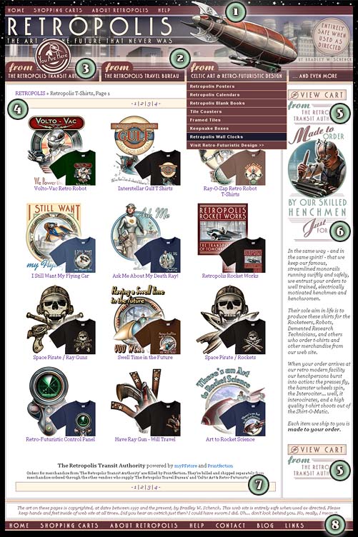
Figure 1 Notes:
1. The header bar for the site. There are links to the home page, a "Shopping Carts" link, an "About Retropolis" link, and a "Help" link. These are the basic navigation links that a user may want at any time – unlike #8, the footer – and have two features ("Shopping Carts" and "Help") that immediately explain how orders are processed and shipped in different ways. Those two links are important, but they need to display only a small amount of information to the user – immediately. For those reasons I use modal DHTML "pop-ups" here. They’re not what you think of as a pop up window – one that opens in a new browser. They’re small(ish), informative panels that come up "above" the page content without leaving the page. Once they’re dismissed, you’re left exactly where you were, on the same page where you started.
2. The site’s main navigation bar. This isn’t in the sidebar – we’d have a long, wandering sidebar if I’d gone that way, and I had other plans for the sidebar content. This is a four-part horizontal drop-down menu. By handling the site’s navigation this way I’m able to create a visual cue – echoed on the home page, where the top of the page is divided into matching columns – which reinforces the idea that we have separate, related sections in the site. This also gave me the canvas on which I’d use another visual cue, which we see in #3. Finally, the last item in the three main dropdown menus is a link to visit the shop these products have come from. I don’t much care if they do; I’m perfectly happy if users stay right here. But it’s another way to communicate the idea that these products are coming from several distinct places.
3. The "You Are Here" graphic hovers over whichever section of the site you’re in. This is another visual cue that I hope will prevent confusion if, for example, you’ve added t-shirts to your cart (under Tab #1) and don’t see those t-shirts in the cart when you’re under another tab.
4. The Breadcrumb and page links bars throughout the site look as nearly identical as possible. The Breadcrumb always links back to this site’s home page rather than to a separate "home page" for, say, the Retropolis Transit Authority. This presented some problems with the Printfection content, but we’ll see why when we get there. Even when the content of the page links bar changes from a pretty standard layout of 1 | 2 | 3 | 4 to something else, it’s still shown in the same colored and bordered rectangle no matter what sort of page you’re on.
5. The "View Cart" buttons at the top and bottom of the sidebar identify the source of the cart (here, "from the Retropolis Transit Authority") to further show the user that this is a cart for these products, not for every product on the site. This is getting repetitive, I know, but as I explained above this single point is the most important thing the user interface needs to make clear. That’s what these many visual cues are trying to do.
6. The sidebars throughout the site are used to add relevant, unique content to the pages. In some cases this is information the user needs, about the products on that page. in other cases the sidebar is just adding some funny bits and bobs that relate to the products. Apart from being entertaining, this is all part of the plan to add unique content to the site pages that will differentiate them from my original shops’ pages. Where practical this content is different when you’re on a main section, a subsection, or a product page. That became a technical hurdle at times – and I can still do more of it – but I came to see this as a basic tenet for the pages: to distinguish them from the pages in the "parent" sites, and also to distinguish them from one another.
7. Page link bars repeat at the bottom of the pages. That probably seems pretty basic but often they’re not included. In fact, giving the user someplace of your own to go when they’re done with a page’s content is always very important, and it’s an area where I think this site design could be made stronger. I’ve been resisting a repeat of the horizontal nav bar down here even though I think it could be of practical value – I just don’t like the way it would look. Also: directly beneath each POD’s content there’s a fine print disclaimer explaining that items in this POD’s shopping cart can’t be combined with items from another’s.
8. The footer repeats the links we saw in the header, but adds some: "Contact", "Blog", and "Links". these are places the user may want to go, but they don’t directly help me to shake all the loose change out of the user’s pockets. So here, at the bottom of the page, they’re available to those who made it this far without looking at more products or – better yet! – buying something.
These features are common to every page on the site, which sounds obvious, but isn’t always as simple as you’d expect. The fact that the product content is being delivered in three different ways – four, when we include some static pages – made the Breadcrumb and page links areas difficult to manage. But remember: we’re trying to make everything consistent while still showing that there are important differences.
The example in Figure 1 is a "Main Section" or "Department" page. Some main sections have subsections, and those are essentially the same; for the most part the changes we see are in the content of the sidebars as described above in #6,
Product pages, on the other hand, are bound to vary between one POD and another. In fact because of the way Zazzle product pages work, my pages have to link to the product page at the Zazzle site – a big, continuing irritation for me. That’s the one area where my site’s inclusive design falls apart, and it’s simply because of the way the tools work. There are ways to work around this, and I may be exploring them, but that should wait till we’re looking at the Zazzle Store Builder.
In all other cases we continue with the same principles we’ve used so far. Product pages will vary, where possible, from the original POD product pages; they will use sidebar content that’s different from the sidebar content of their parent sections; in some cases, they will use sidebar content that is also unique to a single product.
Figure 2: A Product Page (links to original)
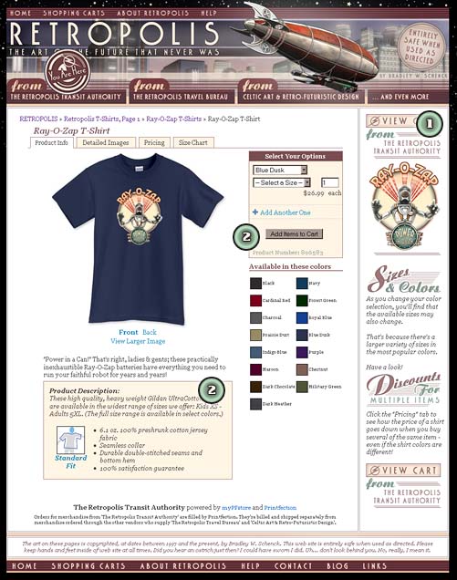
Figure 2 Notes:
1. Product page sidebars continue the convention of using that section’s shopping cart in links at the top and bottom of the sidebar. Otherwise, product sidebars feature content that’s at least slightly different from their parent sections (and sometimes from one another). This may be information about that type of product (as shown) or something completely different. Getting that particular content to appear when you want it was one of the technical challenges I faced here. But it’s worth the trouble.
2. The generic product information areas will be changed, where possible, from the version that comes in from the original POD. This works against a verdict of "duplicate content" for the site. Methods for making these changes differ a bit from POD to POD. More on that later.
So what we’ve seen so far is what I felt were the goals for, and the constraints on, the site’s design – and how I tried to solve the warring goals I was dealing with. I decided on a series of visual cues to help the user understand what was going on in the pages; I provided some informative links that spelled it out in simple language; and I mapped out the ways in which I wanted the site’s navigation to work across sections, and within the sections.
This seems so obvious that I’m in my third draft before I’m adding it – but this is just one solution. I’m not claiming that it’s the only one (it isn’t) or that it’s the best one (no idea!). It’s the best visual solution I came up with this time, facing these problems. The thing you should take away from this is that these are the problems that a site like this needs to solve.
Assuming that I achieved all of those goals, the remaining challenges – as I began to bring in and present the products – would center on keeping visual consistency and satisfying Google’s hunger for the unique, relevant content that would differentiate these pages from the original store pages I’d created at the different print-on-demand companies.
In future posts we’ll look at how I did that, one POD at a time.
My eyes are glued! Wow impressive how you did it. Very helpful in trying to attempt do the same with my site. First i have to get thru all those key words!
NIce site, Design is great- so are your products you sell. Its to bad no one has come up with a mega BIG 3 POD integration script!
Holy cow bless you so much for all this. I’ve been trying to figure out how to tie all my shops together but couldn’t even get to the place where I could define what I wanted them to do, and hearing your reasoning (in addition to seeing what you’ve done) really really helps. Thank you!
Okay I know this post is a couple years old (and I see I’ve already been by to gush at your cleverness), and I also know that you are a very busy man, but I’d *love* to know how you got that nice sidebar full of unique text over on the right at Printfection. Something like that would come in very, very, handy for what I’d like to do with my own PF store.
You must be talking about the custom sidebars at the Retropolis site, I think? That really is the cleverest thing I did over there.
I originally wrote all of that in Javascript, but later converted a bunch of it to PHP (edit – well, I think I did, anyway) so that it would taste better to Google. Which is the whole point – you don’t want your site to look like duplicate content when Googlebot sees it. So more appropriate text in those sidebars is a big plus.
But it’s pretty complicated. I have to read two pieces of information in order for my page to always know what section its content is coming from. First off, I can read the breadcrumb text that comes in from Printfection. That alone tells me most of what I need to know, except – if I remember this correctly – if you’re on the tab state of a product page (sizes, bulk prices, image closeup). To nail those last few possibilities I have to read the URL of the current page and look for the clues there.
Some of this takes place in a hacked version of the MyPFStore breadcrumb file; the rest is in a Javascript file. I just had a look through there and I’m not finding all the PHP changes that I thought I made. So, you know, I’m confused as well. I’d have to go back to my notes.
To figure out what section or a subsection I’m in, though, it gets sort of ugly. I have to test for the names of the sections in the breadcrumb string. That makes it pretty hard to prepare a general purpose version that other people can use. I guess there could be a sort of admin page where you could define those in, um, a perfect world.
For sections there’s a failsafe – if no custom sidebar is present, a default one gets loaded instead. There’s one place I know where there isn’t enough error checking, which is the case where there’s no custom product image for a sidebar. You get a missing image icon there if there wasn’t one to load.
I did have to dig into all of this a few months back, when I put together the Celtic Art Works site because that site works the same way – but I’d have to dig into it pretty thoroughly again before I had a hope of really explaining it. Of course the really cool thing would be to turn it into a system that other people could use – but maniacal laughter just burbles out of me at that thought.
My CPShop pages use a much simpler solution because of CPShop’s hooks; but I don’t think I have a failsafe sidebar for those pages, either.
Oh my gawd I could kiss you! I should at least send you a fruit basket.
I must be cleverer than I thought because that was the idea I thought might work: a script in the sidebar checking for the specific URL, then calling up the correct content. I was wondering why breadcrumbs were so important to you.
I was not planning on using MyPFStore, though; I’m not looking to consolidate all my various POD endeavours on my site proper. I was going to use PF’s domain mapping thing, and so I’m not worried about duplicate content. Mainly I want those sidebars for information about the designs, and the stories/myths behind the images.
Again thank you so much for explaining. That’s more than enough info to get me started.
<3
By reading the breadcrumb I can tell whether a current section is the child of another section. That’s very helpful for me, since different parent sections can have different default sidebars (and other things).
So part of my Javascript parses the breadcrumb string for specific main section names and that way I know whether I’m in a main section, or in a subsection of a main section. For what I’m doing that’s very useful.
I think you’ll have a simpler time by working with domain remapping. The thing that might be a problem is that your PF pages will be limited to whatever you can do in the PF customization interface. I don’t see how you could do some of the things I’m doing in PHP, for example, which is preferable since Googlebot won’t read anything but images and links that you’ve added with Javascript.
It’s confusing and frustrating… parts of the Google system read text that’s written with Javascript but it just doesn’t get indexed even though they’ve been able to read it.